Upload CSVs to generate comparative charts with ease
Download Free CSV Templates
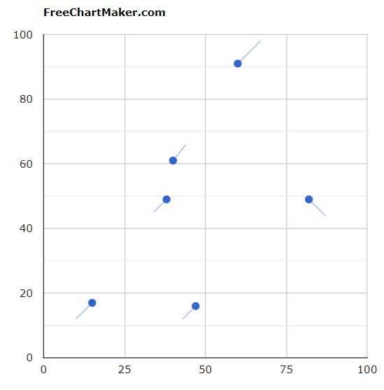
Most studies now requires comparative analysis between past data and current data. But there are limited options to visualize the two set of data in usual charts like area chart, bar graph, pie chart, line chart, column chart etc. All these diagrams depicts the value of multiple iterations of experimental data, but how can be show the change from one phase to another phase. Comparison charts aids in visualization of the difference between two stages of any data. Comparison chart can be drawn using 4 basic charts namely Bar graph, Column chart, Pie chart and Scatter plot.
Let's illustrate with an example
First Phase
| Data 1 | Data 2 |
| 10 | 12 |
| 34 | 45 |
| 43 | 12 |
| 67 | 98 |
| 44 | 66 |
| 87 | 44 |
Second Phase
| Data 1 | Data 2 |
| 15 | 17 |
| 38 | 49 |
| 47 | 17 |
| 60 | 91 |
| 40 | 61 |
| 82 | 49 |
Comparative Chart
© 2026 Learn with Vikas Suhag. All Rights Reserved.